STUDY OF COLOUR
Marcella Morlacchi’s work about Rome had originally a strictly scientific purpose: to realise a study about the colour of the city, that had to be employed as a means to preserve the chromatic value of its environment.
In 1991 she wrote in the introduction of a catalogue of her work: “To be able to recognise the true colour of Rome we should go, during winter, along Lungotevere. From there, with Farnesina behind your back, you should, look through the branches of the plan-trees, at the colour of Palazzo Farnese. There you have the synthesis of the match of the two typical surface materials which, from Roman times to 19th century, are covering the walls of the buildings, protecting and decorating the structure beneath. It’s to say travertine and bricks, in all their many nuances of colour.

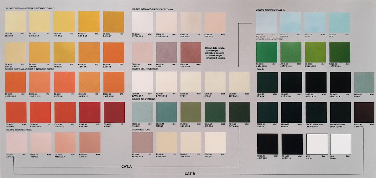
THE PALETTE OF THE COLORS OF THE COLOUR’S STUDY OF THE MUNICIPALITY II OF ROME
Since 16th century (imitating Palazzo della Cancelleria, all in travertine slates, and Palazzo Farnese, with orders in travertine and fields in bricks), stone and bricks appear on the walls of aristocratic palaces. For less rich clients a similar effect is obtained spending less: the same materials are employed partially. That’s why true travertine elements are placed in the most critical points of the structures (angles, basements, etc.), whilst in less degradable or less visible portions of the buildings the two materials are perfectly imitated by plaster and stucco. On these ones a masterly shade of whitewashing eliminates any difference between truth and simulation.
The beautiful nickname of “Rome, the rose-coloured city”, was suggested by the visual perception of the chromatic match between the gold-white of travertine and the red of the bricks. The “sweet colour of eastern sapphire” of ancient memory, (“gris de line” or “pavoncello”) on wall fields in between classical orders, instead of bricks, only represents a peculiar chromatic episode, restricted to 18th century, and to those buildings where the architect strongly felt the need to make the wall box almost evanescent, disappearing. The idea was to obtain, by means of the colour, a “loggia” effect, as if from behind the structural frame the bright blue light of the sky would appear, or the far hills pale green.
As a matter of fact already in 19th century Valadier is again proposing brick surface chromatism, and always after then till to the end of Eclecticism, all the nuances of this material (both true and simulated) come back and take the upper hand on Roman walls, respecting the classical geometric frame of the facades.
THE MOST FREQUENT CHROMATIC ERRORS
But recently we see all around in Rome a very quick work of “colouring” the walls which – with some lucky exceptions – threatens to change entirely the whole chromatic perceptive aspect of the city.
As a matter of fact already in 19th century Valadier is again proposing brick surface chromatism, and always after then till to the end of Eclecticism, all the nuances of this material (both true and simulated) come back and take the upper hand on Roman walls, respecting the classical geometric frame of the facades.
And this is spreading indifferently on the whole urban texture, on the Renaissance as well as on the Baroque buildings, as on the 19th century ones. In all these periods the facades both of public and of private buildings, according to the technological traditional schemes of masonry, were designed respecting geometry and classical orders. And they were largely realised with simulated materials, with a correct chromatism of the surface.
The illusive effect they obtained consented to supply this architecture with a prestigious appearance, thanks to the work of highly specialised craftsmen. These ones would hand down from father to son the simple but extraordinarily effective small secrets of shading, whitewashing and other tricks of this decorative technique.
In “restoring” building today the presence of the classical orders in travertine and fields in brickwork is systematically denied. The harmonious bichromatic effect disappears, as orders are often covered with the same colour as fields. Some travertine elements (columns, corners, doorframes, etc.) are visually broken into two portions, the one in true travertine left visible for all its length, whilst the one simulated in plaster is painted in a different colour, often the very one of the fields, so distorting the architectural original unity. Otherwise these elements appear “coloured” in white, a white which never was travertine colour.
Another story is the one of basements, that are sometimes painted with a dark grey (maybe a would-be peperino?), till to an arbitrary height, completely altering the geometrical relations in the facade or, though respecting geometry, they are sometimes painted with incongruous wrong colours, as the orange of the “restored” circular rampart of Quirinale.
Something similar happens in serial buildings that make the big blocks, as plaster is often painted with colours marking the different portions, giving a sort of sea-resort architecture effect.

But everyone has not the right to change the chromatic value of orders in relation with the fields, because an architectural surface is not a dress that you may change according to fashion or taste. As this surface has a fundamental role in the composition of the space, its colour is integral part of the harmony of the city, representing its feeling and character. That’s why we get so worried when we see scaffolds growing to cover a piece of this Rome that, despite all her faults, we love and feel as integral part of our life.
That’s why it’s necessary and urgent to stem this freedom of interpretation, as the aim of the chromatic restoration of a building is not to embellish it or to make it newer, by means of a new colour on its walls, but to restore it correctly, simply restoring its original chromatic aspect…
…It means to restore to the surface material, true or simulated, its original shade, hidden or altered by layers of smog and of successive wrong colours. And these ones are today very easy to detect, thanks to modern techniques, with stratigraphic analysis. The question is definitely to “restore” a nuance, not to invent a colour.

SOME HISTORICAL BUILDINGS BEFORE AND AFTER THE CORRECT RESTORATION: The Quirinale, the Palazzo Bonaparte towards Piazza Venezia, the building towards Piazza Fontana di Trevi.
